Intro

My name is Eddie Rowe, (candidate number 9147). I'm a media student at the Latymer School. I am working in group 2 with Mario Louka, (candidate number 9099),and Ignacio Flores (candidate number 9049). To view my work, use the 3 labels on the right named 'A2 Research and Planning', 'A2 Construction', and 'A2 Evaluation'.

Group 2 Music Video

My Music Video

Digipak

My Digipak

Group 2 Website

My Website

Showing posts with label A2 Research and Planning. Show all posts

Monday, 21 December 2015

R+P Post 33: Reflections on my role and contribution during Research and Planning

This far into the project I am really please about how we are progressing as a group and how our project is taking shape. I have done a short write-up below detailing what I personally have done to contribute to the research and planning stages of the project.


  • I drew up a timeline of our chosen track, Sun Goes Down. This was really useful working in tandem with the storyboard as it allowed us to more accurately judge whether the length of each scene seemed appropriate or not.
The timeline was where I split the track into logical sections
dependent on dynamics/tempo/feel.
  • I organised testing the studio lighting using the Leap Frog lighting desk during our test shoots. This was really useful both before we had decided to use green screen, as it allowed us to explore colour, and also getting the right warmth and shadow prevention on the green screen when we ended up deciding to use it.
I used the lighting desk to change the colour and intensity
of the lights.
  •  When it came to editing the test footage and constructing a rough edit, I tried out various effects on the footage we had shot.
I key framed colour correction on a shot in the test footage
to see how it appeared.
  • Once we had come up with some ideas for the digipak panels, I created a rough sketch to depict how we all felt the final thing should look.
Final digipak planned design
  • I researched and purchased the glow-in-the-dark paint we planned on using, however after testing we found it did not work as well as we had expected.
The glow-in-the-dark paint I found and ordered online

  • Since I am the DJ featuring in the music video, I have also been involved acting in the test shots.
I acted in the test footage
In conclusion, I think our group are working really well together, contributing equal amounts to the project, and I can't wait to start the production stage.

R+P Post 32: Test shoot and rough edit


Similar to the way in which we organised the rehearsals, we created a shoot schedule for the test shoots for each of the three groups.

Due to requiring the green screen to be set up for almost all our shots, we ended up being allocated less time in the studio than the other groups.


At the very beginning of the test shoot we needed to test out lighting. 

I used the lighting desk to make coloured lighting setups for each
of our 'scenes' and saved them so that we could load them quickly
at a later date.
I edited the Canon 5D's colour temperature settings in order to ensure that the green-screen curtain was a vivid green and that the subjects stood out and were the correct colour. This would make it easier to chroma key them.

I got Mario to stand in frame whilst
I edited the colour temperature settings,
so that I could make sure people didn't
turn out an odd colour.

Although we edited the test shoot footage together on Premier Pro, we decided not to chroma key it and start putting in the backgrounds. We made this decision due partly to the fact that we had little time, and partly as we could not get the full sized green screen for the most part.

We thought that, not being able to get the full green screen curtain, it would probably not be worthwhile doing the After Effects work, as it wouldn't really give much of an accurate representation of what we could achieve in terms of the 'look' for the actual shoot.

Furthermore, we unfortunately couldn't compile a full-length rough edit as we had various mishaps that set us back in terms of time. This included floor lamps blowing and the studio lights getting stuck on incorrect colour settings.


We were still able to decide on some things to work on for the real shoot and edit however. We need to plan ahead for technological issues such as lights blowing, so we will have spares ready by the set as and when we need them. We will also ensure to give ourselves far more time that we predict we will need in order to lessen the impact any unforeseen issues may cause on timings.

The other main aspect that we want to improve for the actual shoot is making each scene appear less sparse. Although this is a lot to do with what we will put in in post-production, we also need to take into consideration how many actors and objects are physically in each shot we shoot, and what their positions are.

R+P Post 31: My call sheet

The next step was to product a call sheet so that all cast/crew knew where to be and when.
We had no major health and safety comments, however we spoke to everyone involved about the general health & safety risks faced on set, this included things such as being aware of where cables trailed along the floor, and not touching the floor lights as they get extremely hot.

The call sheet itself
I found the call sheet very useful for ensuring good organisation, it helped us in staying on top of everything preventing any stressful situations.

R+P Post 30: My shoot-board

In order to be prepared for our main shoot, we created a shoot-board. Now that we have produced our shoot-board, I think all of our group are far more confident that we are going to achieve all the shots we need to the standard we want.

One of the pages of our shoot-board.
We only created one shoot-board as we were only shooting at one location.
The columns from left to right on the shoot-board:

  • Setup No. - This allows us to shoot in order of set up, speeding up our shoot as we don't have to waste time swapping settings.
  • Time - Predicting the timings of shots allows us to have a schedule to stick to in order to ensure no time is wasted.
  • Shot Image - in this box we placed our post-it-notes from our moodboard, this will help us frame and visualise the shots we are going to shoot.
  • Description/Camera/Dialogue - filling this in highlighted to us any areas where we had shots with little variety. Furthermore this will help us when we shoot to instantly recognise the shot we need.
  • Actors/Props - This will help us be organised for every shot so time wasting is kept to a minimum.
  • Director/Camera/Sound - we will list which of our group performed the role for each shot.
  • Last two columns - these columns will be very useful, especially when it comes to post-production as it will allow us to quickly find the best take for each shot and thus speed up the whole editing process.
As shown above, creating the shoot-board was useful for many reasons, a final notable one being that this massively cuts down the amount of paper work we will have to carry around on shoot day as it culminates several other documents into one.

R+P Post 29: Rehearsals

In order to schedule our rehearsal times, we had to meet with the other 2 media groups to discuss time allocation. We attempted to give everyone equal time allocations, and was basically decided around when everyone was free to do work.

In the photo, our group's allocated times are indicated by the blue boxes. Some of these slots not all of our group were free for, so we have indicated those who can use that time slot with an initial.
(M for Mario, E for Eddie, and I for Iggy).


One of the first rehearsal times we had we used to test some ideas we had for using the glow paint. This was when we found that the glow in the dark paint wasn't bright enough to appear on camera, even when shutter speed was reduced and ISO heightened. The following video demonstrates this.

We thought that sunset colours fit the track "Sun Goes Down"
rather well.

We spent a significant amount of time testing lighting set ups using the studio's lights and Leap Frog lighting desk. We tested using filters on the lights as well, due to the fact that early on we had not settled to using green screen entirely. There was one thing we noted that could have worked quite well, we found that having all lights set to variations of orange and dark yellow, and one bright yellow spotlight created quite a good representation of a sunset.


We also used this rehearsal time for trying out shots using Shay. The following video shows us trying to get a zoom that fits perfectly with Shay opening and closing her eyes. I was on camera and Mario was directing in this section.
Zoom test
Overall, we found rehearsals a very useful period of time as it allowed us to spend some time experimenting with ideas we had, and if they didn't work we still had enough time to try alternate ideas instead. (The flop of the glow-in-the-dark paint is a good example of this, as it caused us to decide to use glow sticks instead, which worked perfectly.)
Some of the initial shots we tried out.

R+P Post 28: My kit list

The next step of our preparations was to create a list of all the equipment we planned to use in our shoot.

A couple of lenses we used, a 100mm prime,
 and a 75-300mm telephoto.
Due to the fact we are shooting the entirety of our music video in the studio at school, the majority with the green screen, we can use a lot more kit than we would have had we been shooting in another location.


The lectern was very useful as it allowed us to connect the
Macbook to the studio's sound system to listen to the track
whilst we recorded the lip-sync sections.


Kit List
  • Canon 5D Mk II
  • Canon 600D
  • Lenses (50mm, 75-300mm, 24-150mm)
  • Arri floor lights (x5)
  • Leap Frog lighting desk
  • Studio ceiling lights
  • Tripod (x2)
  • Dolley
  • Batteries (x 6)
  • SD Card (x 2)
  • HDMI cable (to connect camera to TV)
  • 50-inch TV Monitor (for us to see what we record in a much greater detail)
  • Lectern
  • Macbook Pro
  • Studio control tablet
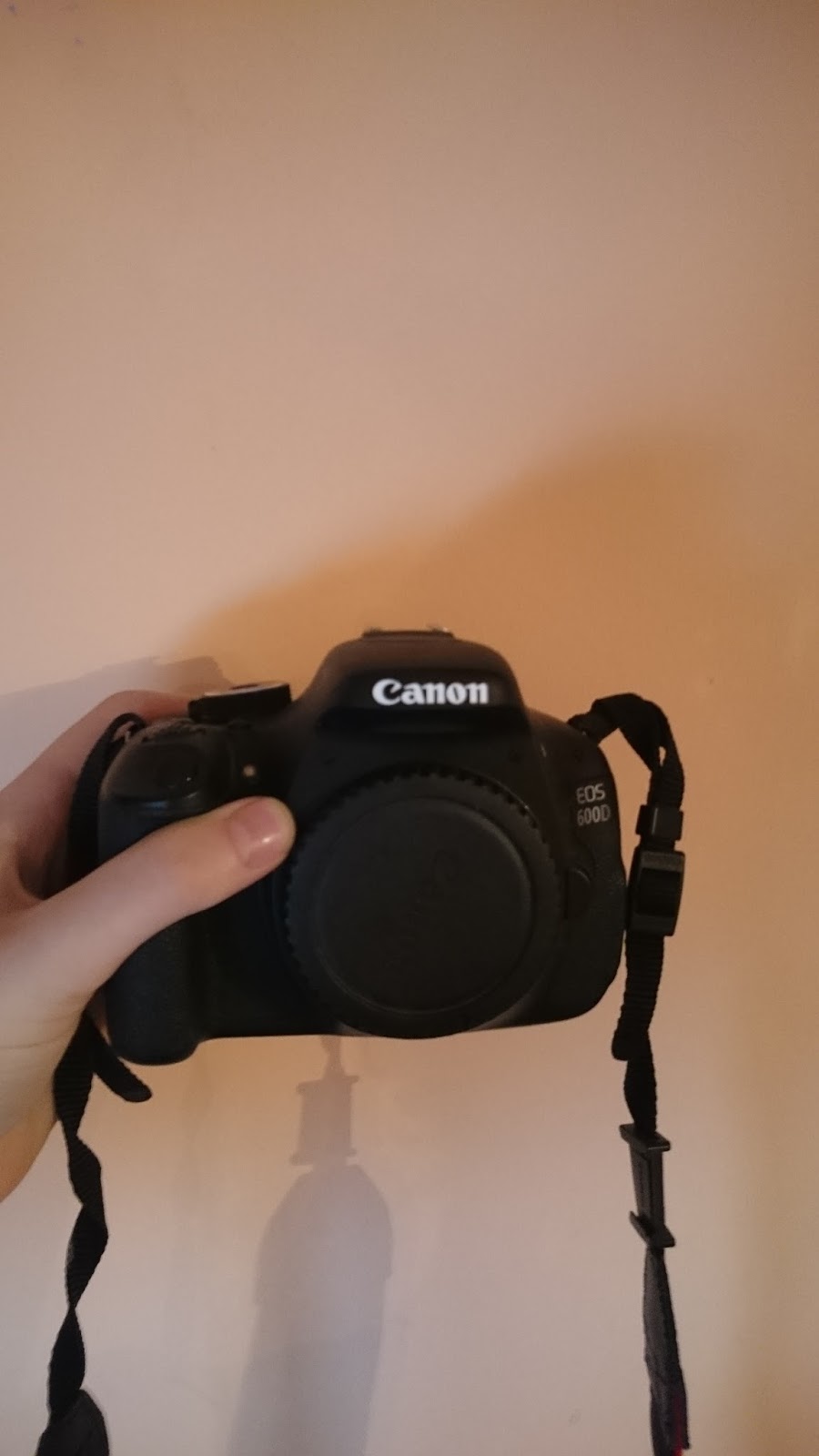
My Canon 600d

Cameras
We alternated between the media department's Canon 5D Mk II and my Canon 600d as not only did this allow faster shooting (as we could have one set up for a CU and another set up for an MCU), but it also allowed us to spend less time changing camera settings.

It allowed us this as for many scenes we required slow motion, and so we could leave my camera set to shoot at 50fps whilst the other was still 25fps.
The Leap Frog lighting desk.

Lighting
The Leap Frog lighting desk was very useful as it allowed us to save our settings for which lights were on or off, and what intensity we had saved them at.

It saved these set ups as 'memories', and these memories could be loaded to instantly pick up from where we left off when testing.

R+P Post 27: Casting

The casting process was probably one of the more difficult decision-making times for our group. We had several group meetings in which we discussed possible choices for each role, and debated how appropriate they'd be.

We initially cast Arian as the main
character.
Initially we chose Arian to represent the main character as he physically looks quite young, and felt he'd be fully capable of portraying the character in the way we wanted as he was very involved with the school's drama department. Alas many scheduling issues arose as it turned out he was involved in the school play, which held rehearsals and similar times to us.

After some quick deliberation, we settled on having Shay to play our main character. We chose her as she was very enthusiastic and we knew there would be no scheduling issues as she had almost the same lessons and free periods as me.


Main character
We ended up choosing Shay to play our main character. We felt that although she was not our first choice, EDM music videos often appear very gender-neutral, and thus we decided it wouldn't impact our video nor the audience's experience if we had a boy or girl. Furthermore, due to her studying media, we know she has already been on set in front of a camera and will be capable of performing.


Orlando
We chose Mario to play the role of our artist Orlando. We decided this mainly due to the fact that, as an avid consumer of EDM, he has been to many watch many different artists of the genre live. We believe that this means he can do a good performance in terms of impersonating how they appear on stage. To add to this, he has done lip-syncing videos before, and as he is in our group, no one else knows better the character we have designed.


DJ Ed-E
We agreed that I should play the character of the DJ. Like Mario, I enjoy listening to EDM music a lot. Furthermore, having performed before in other media projects as high-energy characters so felt I would be capable of pulling this off. To add to this, I have the same scheduled media lesson slots as the rest of the group, so scheduling won't be an issue for things like the shoot days.


Extras & Dancers
In terms of extras/dancers, for the most part we utilised the other students in our media class. The reasoning behind this was two-fold. Part of the reason was due to the fact they were happy to commit some of their free time to be in our video, and partly because we had discussed the concept of our video to them numerous times before. Mario also brought in a couple of friends from outside the media department as they were also prepared to commit to the shoot days and we felt they would fit the required roles well.

Pictured left: One of the dancers we cast.

R+P Post 26: Set design, locations, and props

The next stage of our research and planning was to consider set design, locations and props.

As we have decided to shoot virtually our entire music video on green screen, we realised we don't need to take backgrounds into consideration for the shoot. What we do need to focus on however is set design. We must do this in order to evoke to the audience a better sense of where each scene is supposed to be taking place, making it recognisable. There are some things, such as the flag, that we aim to add in in post-production however, so there aren't too many props we need to prepare.

The glow in the dark paint I bought that ended up not working.
Originally, I ordered pots of various colours of glow-in-the dark paint. This paint would be used to make signs such as one that says "Sun Goes Down", and we were also considering painting props such as the water guns. However once they had arrived, we tested them and found that they were far too faint for the camera to pick up, even when I lowered the shutter speed and increased the ISO. For this reason we decided to scrap the glow-in-the-dark pain idea and replace it with glow sticks.

The balloons, confetti, and party poppers Mario bought.

Mario ordered the glow sticks on-line, and also went to a party shop where he purchased balloons, confetti, and party poppers. All of these would be used in the party scenes.

Mario and Iggy tested the glow
sticks in the darkened studio, and
upon editing the footage I found
that adding the 'glow' effect in
After Effects brightened them nicely.


Full prop list for the shoot:

  • Book
  • Piece of paper
  • Pen
  • Desk
  • Beats headphones
  • Water guns
  • Mixing desk
  • Table
  • Microphone and stand
  • Part poppers
  • Balloons
  • Confetti
  • Glow sticks
We weren't initially sure where to source the microphone and mixing desk, however after a group meeting we found out that the media department at school had these items, so we were all set.

Leap Frog lighting desk
We also tested lighting for our music video. Using the Leap Frog lighting desk I adjusted the intensities of various ceiling lights in the studio until the green screen appeared to be smooth with little shadowing. We also had green paper stuck to the floor in order to make sure the green screen extended far enough, as the actual physical curtain didn't trail along the floor that far.

R+P Post 25: Costumes, props, and make-up

The next stage of our research and planning was to determine our costumes, props, and make-up. We created a list of planned props, make-up, and costumes so that we would be prepared for the shoots.

For the three main cast members, we created a table listing the following:

  • Their role
  • A photo of them
  • Their costume items
  • Their hair & make-up
  • A reference image (the biggest influence)

The character Shay was playing was intended to appear innocent and almost 'pure', hence we chose a white top, we also chose bright colours for her in order to give her the look of someone younger, almost like a child. Furthermore we plan to style her hair into pigtails to reinforce the youthful look. We believe that this combination should achieve the effect we are going for.
Shay's entry in our table of costumes
Mario's role was that of being the singer Orlando. Relying upon our previous research, in which we found black to be a very commonly worn colour by artists of the EDM genre, we decided that we would adopt it too. We decided Mario should wear a black t-shirt, black trousers and trainers, and sunglasses. These sunglasses will act as something to help create his 'signature look', ratified by the sunglasses appearing in other places such as the website and album cover.
Mario's entry in our table of costumes
My role was to be the DJ, the style for which we ended up deciding to keep quite straight-forward. We considered having a plain white t-shirt, however we wanted to demonstrate a clear difference between me and Orlando, so we ended up deciding on a black and white graphic t-shirt I had.
My entry in our table of costumes
We also created a dedicated props list for anything that we needed to remember to bring that wasn't part of the costume list for the cast. We structured the prop list by set-up as we felt that would be the most logical way of organising it.
Our prop list
These acts of preparation before the shoot were brilliant for us as it helped us organise everything early on. This included giving us time to ensure we had all props and costumes sourced well before the shoots, and furthermore allowed us to use them in our test footage.

R+P Post 24: Planning my digipak panels

The front and back panels of Calvin Harris' album, "18 months"
Having planned our website, we decided we would plan our digipak panels.

We decided the best approach to designing our digipak would be to first look at existing albums by other artists in the EDM genre, and ascertain what conventions seemed to be followed with their albums.


After looking at existing designs I found the following to be common conventions:

  • The album name is usually displayed clearly on the front and on the spine.
  • A track list is usually shown on the back cover.
  • There is always a barcode, usually on the back.
  • There is usually institutional information alongside the barcode.
  • The artist name is usually shown by the album name.
Hardwell's album 'United We Are' also reinforced the aspects of
album covers I felt were conventional.
Most of our designs include pictures of our artist on the cover as the relationship between the audience and artist needs to be reinforced.

Initially we were not sure what to display on the inside of the digipak, we decided we should have a photo of Orlando on one of the inside sides.Feedback from classmates suggested we should also put something on the side the disk would be on. 

Our label's logo (we decided to use the same
style of vinyl record as a graphic underneath
where the disk would rest in the digipak.)
Ignacio suggested putting a vinyl disk (like our label's logo) on the disk side. This sounded like a good idea so we all agreed to it.


I decided to draw up a rough sketch of the design ideas we had come up with and agreed on, I then annotated this with the conventions of album covers that we were planning to include. The sketches are shown below.

The design I drew.

R+P Post 23: Planning my web pages

At first we considered creating hand-drawn flat plans for our web pages, however quickly realised that doing them digitally would be a better use of time. I suggested we used Microsoft PowerPoint for this as it is very easy to hastily add shapes, boxes, text, and images, and arrange however you could want.

We needed to create a website iconic of the genre, so of course we tried to follow the conventions of the other EDM big artists, such as Martin Garrix and Calvin Harris. We also knew we should follow the same colour/shape scheme throughout the website in order to keep synergy with the other media products, such as the digipak album cover.
Our "tour" page was inspired mainly by Martin Garrix's page
on his website, where fans can see dates/places, and buy tickets.
Calvin Harris' website uses the navigation-bar logo in the
top right, something we've decided to follow.

Front page
When the top right icon is clicked,
the nav bar is displayed.
 The screenshot on the left shows what the front page of the website would look like.

The clickable logos in the bottom right of the website would be across all pages, and would link to Orlando's spotify, instagram, twitter, and facebook respectively.

There is also a UK flag, which users could click in order to choose their language.

Tour dates
Image gallery
 We plan to have a tour page, so that fans can easily find out when and where the next concert is that Orlando is performing at. These would be clickable and link to a page where fans can buy tickets to these shows.


The gallery would show images of Orlando, allowing the audience to feel a part of his personal life.
These images will also be interspersed with Orlando's Instagram feed, which fans can follow.

"About" page with Orlando's bio.
Video gallery
 We have decided to include a bio page for Orlando. This is something that not all of the websites we've looked at include, however we feel that knowing an artists back story gives the audience a more intimate experience.


On the right the screenshot shows that we are planning to have a video gallery, this will act in a similar fashion to the image gallery, as a way for the audience to feel more involved with Orlando, and "in the know".

R+P Post 22: Planning my promo shots

Seeing as we were going to have promo shots on the digipak and website, we needed a photo shoot to capture these images. In order to sufficiently plan for this, we arranged a group meeting in which we deliberated the types of shots, what would be worn in the shots, and what poses we should have.

I drew some of the shots that we felt we definitely wanted to
try out during the photo shoot.
We knew we wanted a range of shots of Orlando and DJ Ed-E together, so we looked at existing promo material for various artists to get an idea of the type of poses conventionally used. 


In terms of costume, we ended up agreeing on two costumes centred around black and white colours. This was inspired by promo shots from Calvin Harris and Hardwell.


One of Hardwell's promo shots, mainly
wearing black and white.
Avicii's side profile headshot.


This shot of Disclosure is our biggest influence for
our ideas for the two-shots of Orlando and DJ Ed-E.

We felt that in most of the real promo shots we looked at, the artists usually had quite blank or serious expressions.

This seemed to suggest that most go for a style of trying to look 'cool' to attract their audience. This reflects the fact that their target audience is mainly young people, however the fact they don't have photos aiming to appear 'fun' suggests that there is a quite notable cut-off point for the lower ends of their audience.


In relation to our photo shoot, this suggests that perhaps we should be focusing on making Orlando appear cool, rather than just fun-loving. We should include a range of photos, some to give off both of these traits.

R+P Post 21: My key shots storyboard

We decided to make a key shots storyboard to add further detail to what we had planned out when creating our timeline, and get a rough idea of specific shots we wanted in our music video.

After procuring a couple of large pieces of black sugar paper, we used post it notes to show shots, drawing on them what would appear in the frame. We had different colour post its to denote what framing each shot would be. Yellow was for long shots (LS), greyish/pale blue for mid shots (MS), and blue for close ups (CU).

A picture of the majority of our
storyboard
The last chunk of our storyboard with
 the colour code key at the bottom right
Character or prop movement was communicated via a thin arrow, whilst camera movement such as pans or tilts was shown via thicker arrows. We also wrote out short notes above shots if there were any other details of what would be happening (such as cgi to be done in post-production).

One of our post-it-notes, a long shot
denoting the main character
drawing a flag.

On many of our post-it-notes we wrote short captions to clarify what was supposed to be happening in the shot. This appeared more often on shots with complex movement.

Creating a storyboard like this was really useful as it allowed us to iron out any gaps in the progression of shots in our music video. Furthermore by using post-it-notes we were subsequently able to re-arrange shots as and when we wanted to.